減塩POP

LOCATION - 企業社員食堂

減塩POP

日本に多く見られる塩分の過剰摂取は、血管を傷つけ、そして脳卒中や心疾患に繋がっています。そうした背景をふまえ、日常的な生活で塩分量を意識することを目的に、企業社員食堂での減塩実験を実施しました。
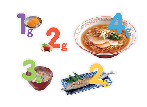
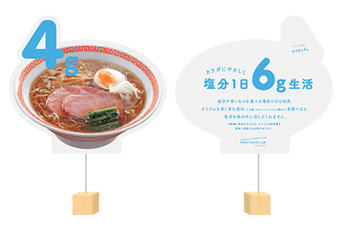
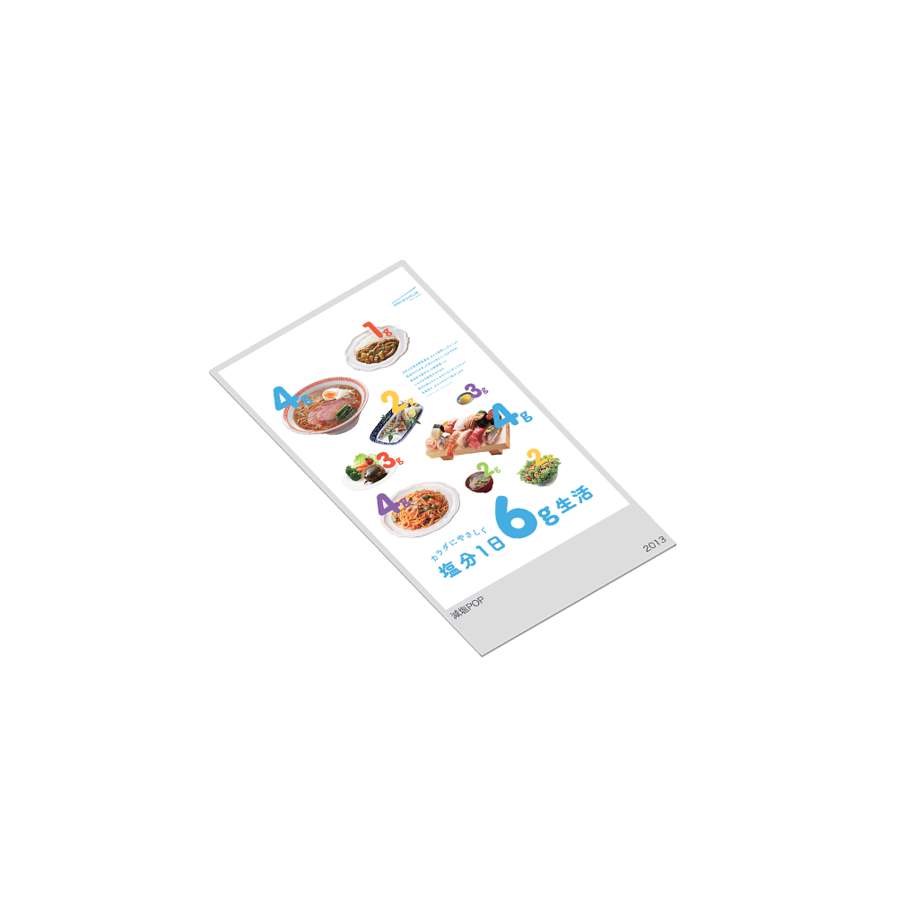
子どもの知的玩具のようなポップな色使いで、食べ物に含まれる塩分量を視覚的に伝えます。
食堂内での人々の動線上にあるさまざまなタッチポイントを活用し、食行動の変容を引き出す魅力的なアイテムを活用しました。具体的には、ポスターやPOPなどの目を魅くアイテムを制作し、戦略的に展開した結果、一日あたりの食塩摂取量を10%以上減少させることに成功しました。

Salt Reduction POP

LOCATION - Employee Cafeteria at a Corporate Office

Excessive salt intake, common in Japan, damages blood vessels and contributes to strokes and heart disease. To raise awareness of daily salt consumption, we carried out a salt-reduction experiment in a corporate employee cafeteria.
Using vibrant, toy-like color schemes reminiscent of educational playthings for children, we visually conveyed the amount of salt contained in various foods. By strategically placing engaging materials—such as posters and point-of-purchase displays—along key touchpoints within the cafeteria’s flow of movement, we aimed to subtly influence eating behavior.
As a result of this strategic and visually compelling intervention, we successfully reduced daily salt intake by more than 10%.